No, I'm not done with character designs, I just thought you guys might want to see a little something different. That and it's nice to do something different for a little bit. Anyway, you guys might be wondering what Visual design is, as I have already referenced the setting of the world. Visual design is the colors and graphical style that the game will use. This covers things such as the color palette of the game and levels as well as the graphic animation, modeling, textures, shading, etc. As you can probably guess, I'm not going with a style that Sonic has seen before.
I'll start off by talking about the color palette. SatLoA should be a very bright colorful game with lots of brighter colors. Any color used on the palette, for the most part, should be a brighter shade of that color as opposed to a darker shade. The world should appear very vibrant and live through the use of its color. Although each level should have its own distinct color scheme, there should be attention given that the primary colors are not the colors of the protagonist characters. Colors should also have a fairly high contrast in many places to help give the world of Atlantis that "surreal" edge.
World Textures: Textures should be sharp, distinct and fairly detailed. We're not going for the cartoon look of Warcraft nor the gritty realism look of Gears or Resident Evil. While the worlds graphics should be as detailed as needed to make the world look good, there should be a bright quality to it that makes it appear slightly unreal (sharp color changes). The textures should not be overly detailed, as it will contrast with the characters and make things appear slightly unreal. Concept artists should look to titles like Mirror's Edge and Sonic CD to see how abrupt color contrast can be built in world artwork and textures. Texture work should also see the Imagery and Modeling section, geometric shapes and patterns should be worked into the textures themselves for the world, although be used softly if en masse as to not overwhelm the player.
Example of a contrasting, sharp world image done by DICE Studios: Mirror's Edge
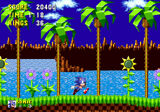
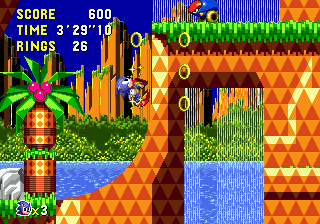
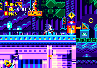
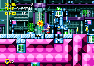
Imagery and Modeling: In early Sonic games, much of the artwork was very abstract and geometric, something that later Sonic games did away with (likely as it was viewed as harsh with early experiments). This distinct visual style was a very unique selling point for the Sonic series, as visually it was a recognizable world, but the geometric imagery and world at once both seemed familiar and unreal to the player. Atlantis will be using this same art style with geometric shapes and sharp edges, combined with its use of bright colors and contrast, to achieve this look. For example, these trees from Sonic 1 make use of geometric shapes. This piece of concept art for a Sonic game (actually Sonic 4) shows the highlighted attention to sharp shapes and angles. This screenshot of Sonic CD again highlights the high contrast and angled appearance of the world and it's scenery while these images show how such a look could be held for a more technological level setting.
The Character Models: All character models, player or otherwise, will have a different look then the world. While the world will be crisp and clear, any and all game characters (player character, enemies, NPCs) will be rendered with a thick lined cell shade effect. The idea is to give all characters a lined appearance as if they have been drawn in the game world. Not super heavily cel shaded (like Wind Waker) but more along the lines of the last Prince of Persia game (More reference pics). Slightly more thick lined however. The line thickness will need to be variable (example, Sonic's spines when viewed from the back should be thicker lined at the tips with reduced line thickness as they get closer to the body of the character) and will need to change on the fly to accentuate movement.
Animation: The Animation should be extremely fluid. None of this jagged animation from earlier Sonic titles where characters mouths would jump and characters would snap from position to position. 60 fps here, if there isn't a fluid movement from one action to another someone's not doing their job. Nor should there be exaggerated animation with overlarge mouths or facial expression. Keep that grounded. Another thing there should be none of: Prior 3D sonic games have loved to give bouncy (and cheap) physics animations to certain areas of a character, leading to ridiculous waving on starts and stops of random areas of character models. Examples include Sonic's spines and ears, Knuckles dreadlocks, Tails ears and hair tuft, and Rouge's...um...ears. Sonic Adventure 2 was by far the worst offender with this. There will be no random bouncing that makes it look like the characters are cheap action figures on springs. Movement needs to look organic and fluid.
A special note here should be mentioned for the accentuation of movement by cel shading lines during combat. With especially quick movements, the cel shade lines should get slightly thicker in the direction of the action and slightly thinner away from the action. So when Sonic strikes a blow with his staff, the staff will have slightly thicker lines at the area of impact (or at the tip of most speed if no impact) while the rest of the lines will thin slightly based on distance from the impact. Lines will thicken on the impacted area the staff will impact as well. This will be slight and fast, but will have a subconscious effect of drawing players eyes to the impacts in combat, giving them more weight and more effect.
Now that you've read all that, try to conceptualize it in your mind. Comments?
No comments:
Post a Comment